The session/track attendance numbers from the San Francisco Oracle Open World came out late last week, and a couple of PMs from the BI group took those numbers, built a Discoverer EUL on top of it, and cranked out a number of reports, and all in less time than it would take to say 'Wow! That was quick, and good!' (btw - the final numbers were that more than 35,000 people attended Open World! And if the Siebel acquisition goes through, then expect that number to go up even more!)
This post is not really about the data per-se, but more of a followup on the last couple of posts from Keith and me on the value of graphs and the huge number of very useful graphs already available in BI 10g - Discoverer, Beans, etc... (specifically, see 'Making more of BI Graphs' and 'More on the bubble graph').
Bubble graph - here the X-axis represents the number of sessions , Y-axis the average attendance per session, while the size of the bubble is the percentage of sessions in a track that were more than the conference average.
 A standard pie graph, each slice represents a primary track, and the percentage figures are for total track attendance.
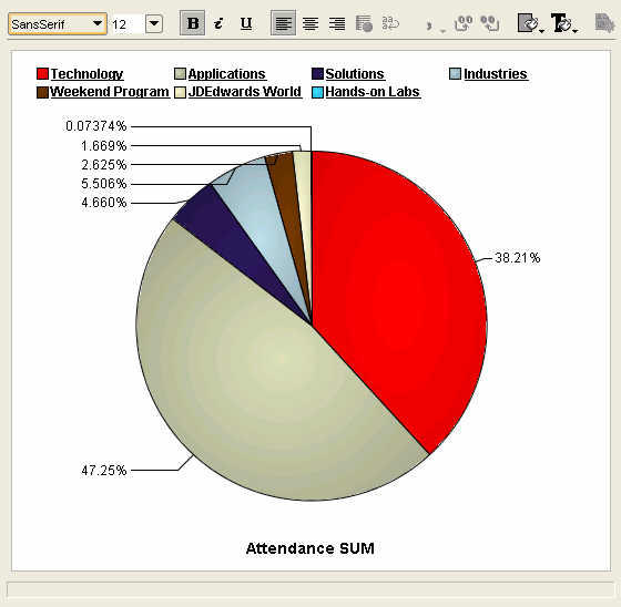 Click on the 'Technology' track legend label, or double-click the pie slice, and the pie graph updates with percentages for the Tech-tracks. The database continues to garner the lion's share of the attendees, with the application server following at 25%, and BI-DW in third place in a little over 10% share of all Tech-track attendees.
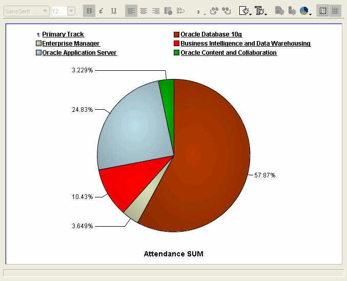 And this is an example of running amok with a pie chart. And also illustrates very nicely how a different graph may make this data look much more readable. The pie chart below shows attendance percentage figures for all the BI-DW track sessions, all 29 of them. Not very useful, right? Let us take a look at the next graph then.
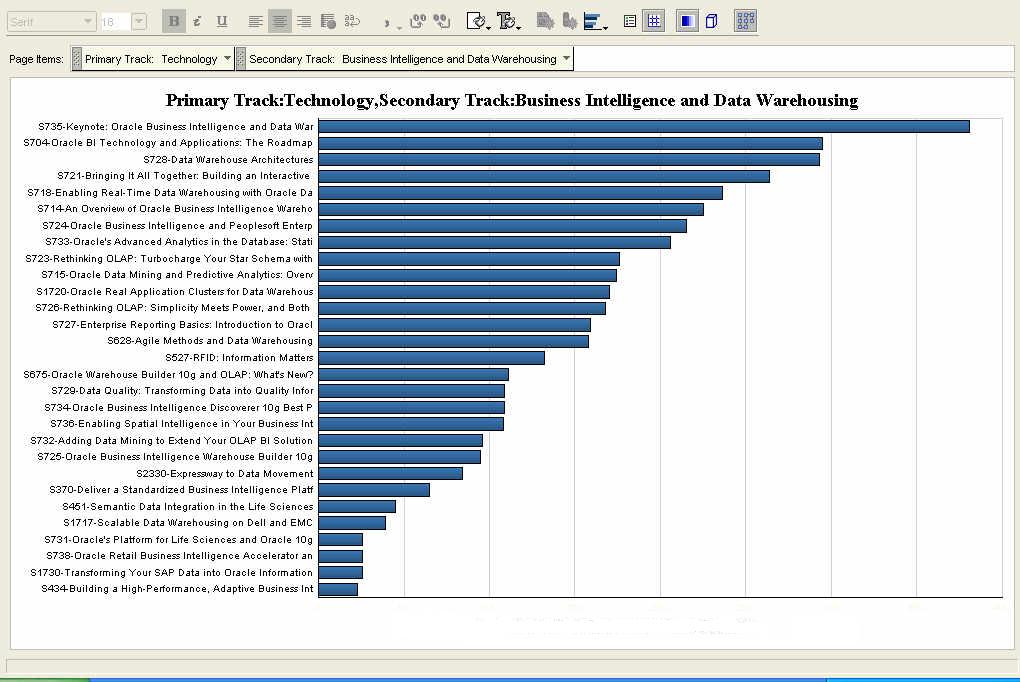
 This is a graph showing the same data, but this time as a horizontal bar graph. That's it. A simple click of the mouse, and I changed the graph type from 'pie' to 'horizontal bar'! When we say Discoverer is simple to use, we are serious.
Ray's BI keynote was, unsurprisingly, the most heavily attended session. This was also the only keynote for the BI-DW track. And this session was also the one where the now-fabled Report Center was shown, publicly, for the first time. (Disclaimer: I am not saying that Report Center will be called Report Center when it ships, if it ships. Take it only as a demonstration vehicle of concepts and designs we have been working on internally, nothing more, nothing less.)
Below are two bubble graphs, showing the same data, but the second displays a smaller set than the first one. The X-axis shows the number of sessions, while the Y-axis shows the total number of attendees for the track. The size of the bubble is the average attendance per session. But with so many sessions, this magic quadrant is not very readable, is it?
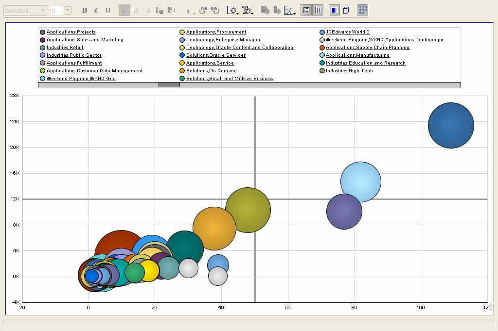 Here I have taken the same graph as above, but applied a ranking filter to display only the top 10 sessions - where the ranked measure is total number of attendees. BI-DW is the bright red bubble, below and to the left of the orang-ish bubble. This is only one way of showing the bubble graph - you could decide that the size of the bubble should be the number of sessions, and that average attendance should be plotted as an ordinate or abscissa. Either way it's your choice.
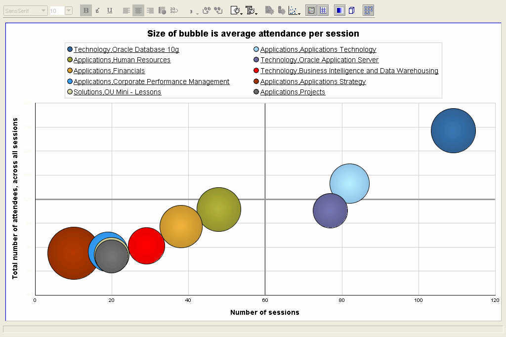 Pareto graphs are very useful for performing 80-20 type of analysis. The bars show the values that make the whole, while the line shows the cumlative percentage contribution of the individual parts thus. It is sometimes also called a 80-20 graph because these graphs illustrate very vividly the fact that usually 80% of something is contributed by 20% of its constitutents. E.g. 80% of a company's profits may be coming from only 20% of the products it sells. Here in this example it should come as no surprise that applications and technology accounted for more than 80% of all attendance.
 Update: I posted this, and then realized that I hadn't answered the semi-rhetorical question I had posed at the start of this post, "What's the good thing about eating your own dog food?". Well, I am hoping that people won't really expect an answer to it, after having read the post, but for the sake of completeness: when you eat your own dog food, you use the product like a customer. Which means that you are not using it as a developer, or QA engineer, or product manager, or support engineer, or sales person. You are using it like a customer would, doing the things a customer would, and the things that you would try and rationalize about as a developer, you will positively get irritated with, as a customer. And this then engenders the most valuable and useful feeling that we as product managers and developers and testers should and must have: empathy!