My favorite graph type is the Bubble Graph.
Most people are familiar with this type of graph as it used extensively by market research companies and is often referred to as a “magic quadrant”. The Discoverer Help system provides the following help text for bubble graphs:
Bubble - graphs to show data in a similar way to a scatter graph, but with an extra dimension that uses the size of the bubbles. Each bubble is a value whose coordinates are specified by three numeric measures. A bubble graph is useful for comparing data that has three measures.
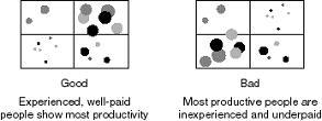
This type of graph is perfect for helping to both identify and quantify business issues all at the same time. The term magic quandrant is often used because the graph can be divided into four sectors and each sector has a specific meaning. Usually the top right is the best place for your data points but it all depends on the message you are trying to convey.
To take a simple example, you could use a bubble graph to plot salaries, years of experience, and productivity for your work force. You expect higher salaries for more experienced employees, and you expect these employees to be more productive.
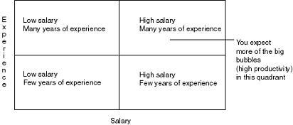
If we actually plotted some data for this subject area we might generate graphs somthing like this:
I have used this graph quite a lot in recent demos and in some customer implementations since it is the easiest way to view a relationships between different measures. My favorite example is from the retail arena where we used bubble charts to solve a specific business problem. Every Monday, category managers would review sales and production data from the previous week. Typically each manager would be responsible for over 100 different products. They had a very short time to analyze the data and place orders with the various buying groups to either plan to order more or to slow production. The problem was how to present sales and production data in an intelligent way to allow the managers to focus on those items that generate the most margin for the company.
We used bubble charts as the starting point for analyzing their products. On the X-axis we plotted 4-week sales and on the Y-axis we plotted 4-week production data. The size of each bubble was derived from the product margin. The aim was to have products in the top right quadrant as this indicated high sales and high production. Any categories in the lower right or upper left quadrants were either selling well but planned production was not high enough or production was too high for the level of sales and so stock would be increasing. This made it very easy to identify the problem categories.
However, within those categories which ones should you select for further analysis? You could drill down on each and every bubble, but that would take a long time. By focusing on those categories that have the biggest bubble, i.e. those with the highest margin, the category managers could focus on those categories that were likely to have the highest impact on their overall profit. It was simple and extremely effective.